Selected colour swatches
You can order up to 20 colour swatches
How to create a colour scheme
Understanding how colours go together is part science, part art and part imagination. Here’s how to nail your new scheme the British Paints way.

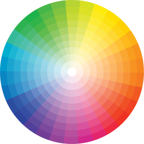
Colour schemes are simply combinations of colour that look good together, and give a pleasing balance to a room or exterior project. Since time began, people have been working out good combos, and understanding how different schemes work can help you set the entire mood for your home. A good tool for this is a colour wheel, where you can see how colours relate to each other at a glance. You can use a colour wheel to develop your own scheme, using one of these three key themes.
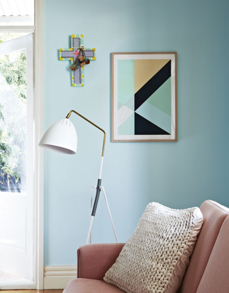
Monochromatic
A hit with minimalists everywhere, a monochromatic colour scheme is created using variations of any one colour. It’s relatively easy to achieve and can be visually effective – it’s a great way to introduce elegance and calmness to a room. Lighter tones can create a warm and soothing feel, while a darker palette can give a more dramatic effect. A variation of this is to introduce an accent colour that contrasts with the basic mono scheme – especially in the ever popular all-white space. Used sparingly, it can be super effective in the overall design.
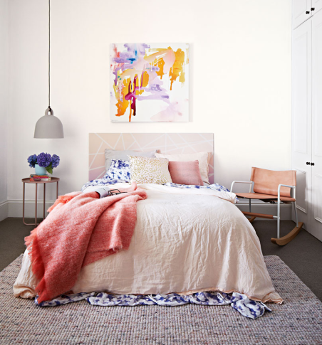
Complementary
To use different colours that work together, a complementary (aka contrasting) scheme is the way forward. You can find complementary colours by choosing from opposite sides of the colour wheel, for example, blues from one side and yellows from the other. While the two colours seem to bounce off each other, they can be balanced and soothing, too. Colours from different families that you might think would clash, can actually make a wonderfully strong statement. Think Andy Warhol portraits that contrast red with green or purple with orange. It’s a simple way to dial up the personality in your home. A ‘split-complementary’ colour scheme is a variation of this scheme. In addition to the two base colours, it also uses the two colours either side of the hero colour. This gives you the same strong contrast, but the overall effect is softened a little.
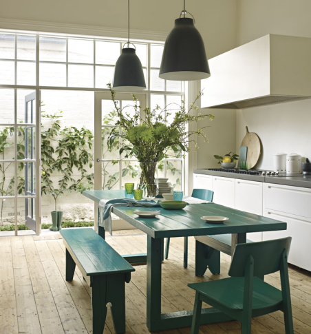
Harmonious
Also known as analogous, this describes a scheme that includes several adjacent slices of the colour wheel that work in harmony. These schemes are often found in nature and are considered pleasing to the eye – they work together without the impact of the contrast you’d get by using a complementary colour scheme. An example might be blue, with teals and greens. The rule of thumb is to choose one colour to dominate, a second to support and a third as an accent. You can then add neutrals such as timber or stone to your palette for a bit of visual relief.