Selected colour swatches
You can order up to 20 colour swatches
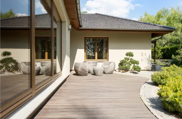
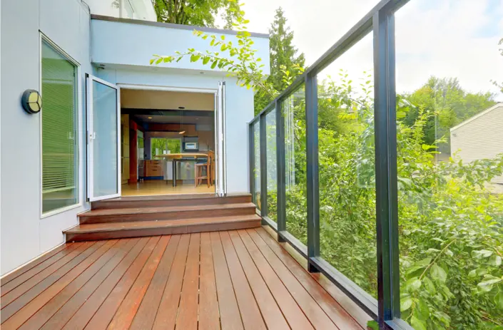
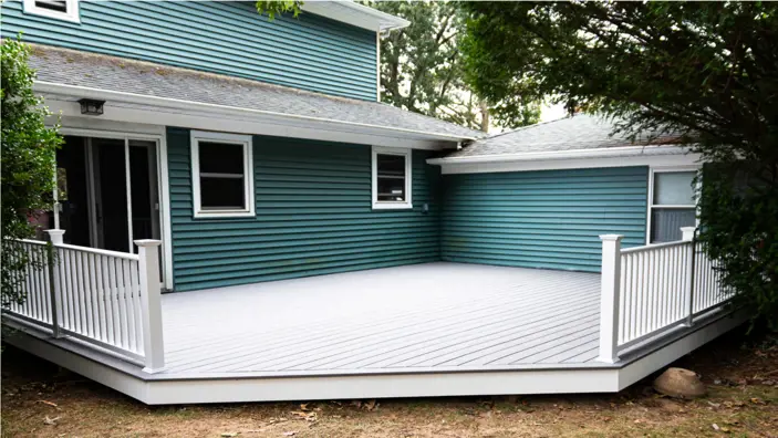
Deck

The deck isn’t just an added extra in most homes — it’s a place to gather, somewhere to unwind, and chances are it’s someone’s pride and joy.
And if it really is an ‘outdoor room’, that means you need to take a good look at the walls and the furnishings as well as the flooring. (At least you don’t have to worry about the ceiling.) So how to choose a colour scheme that complements your beautiful timber decking? Read on.
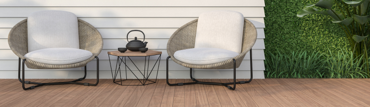
Pale Wood
If you have a pale timber deck such as nautral treated pine or light oak, you have plenty of scope with the colour scheme. One way is to use contrast to define the outdoor seating area. Take inspiration from the classic combination of black and white, but achieve a similar look with any dark and light pairing. Paint fencing or walls with a deep on-trend navy such as Midnight Whirlwind or an earthy olive such as Daintree Beauty. Repeat the pallor of the boards with pots in Soy Milk or Simply Vanilla to pull the look together. Alternatively, if your space is small, it might be better to opt for a lighter scheme across the decking and surrounds to create a fresh and summery look all year round.


Midnight Whirlwind 392 Daintree Beauty


58 Soy Milk 80 Simply Vanilla
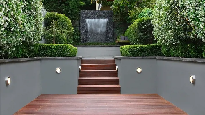
Mid to dark brown
Bold shades are having a moment, so if your deck is a rich mid brown — perhaps Merbau, Spotted Gum or blackbutt — that’s a great foundation for a striking exterior living space. Rich or darker shades provide the perfect backdrop for lush green foliage and colourful flowers and shrubs, coming together to create that outdoor oasis feel. Stick to complementary colours for your paint scheme — other neutrals including cream, beige or a dark chocolate such as Dark Master will work well on walls and sheds. Liven things up with fresh blues, greens and turquoise (try Turquoise Whirl) for accent colours in the pots, planters and soft furnishings.


46 Dark Master 338 Turquoise Whirl
Red brown
Deck boards with a fiery red and orange hue blended into brown tones, such as red gum and jarrah, make an outdoor space look warm and inviting. A lush green landscape of lawn, succulents and tropical foliage will beautifully complement that otherwise dominant hue. Keep the rest of the scheme on the downlow, with natural stone colours such as Mineral Salt and charcoal (Road Ahead). Add a pop of bright colour with cushions in mint or red to change up the look from season to season.


424 Mineral Salt 441 Road Ahead
Weathered grey
From weathered ash to charcoal, grey puts the focus on the colourful elements of a garden, be it the natural landscape or a painted feature wall. Shades from the blue and violet parts of the colour wheel (try Anna Jasmine or Violet Pod) will harmonise with paler surrounds, while a dark backdrop will make accent colours stand out. This is a good opportunity to go bold with painted furniture and planters in brilliant jewel shades such as Bollywood Jade, Glazed Ruby or Topaz Dream.
Looking for colour schemes for other rooms?


236 Anna Jasmine 240 Violet Pod

324 Bollywood Jade 83 Glazed Ruby
88 Topaz Dream