Selected colour swatches
You can order up to 20 colour swatches
New Seasons’ Tones
We’ve found our favourite autumnal tones to work with such as soft blues, peach, blush and dusty purples – which when experimented with, can work well collaboratively or as a stand-alone feature.
New Season Tones
Working with autumn hues such as soft, dark blues work well in large features such as a sofa, or as a feature wall. Against white walls, navy pairs well with blush, the Pantone colour of 2016.
Tip: Separate the palette by using navy and blush in different rooms of your home for a consistent flow throughout.
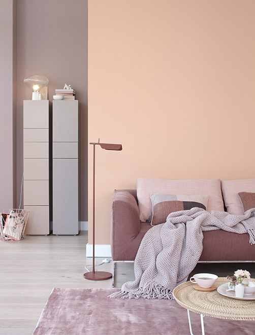
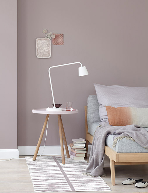
Peachy Decor
Peach as a colour base is often overlooked, but it works well in a neutral home.
We recommend British Paints Rose Vision or Retro Peach as feature wall colours, decorated with light neutral furniture. Or use contrasting dusty purple like Peter Fehrentz has done below for a modern 70s look!
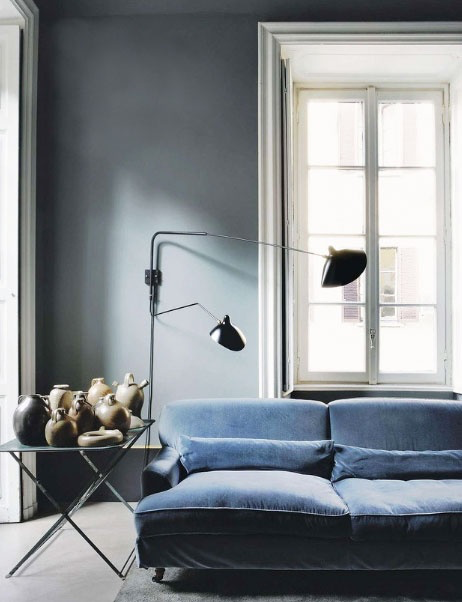
Soft Blues
If you are working with darker tones on your walls, like a British Paints Original Grey, soft blue hues compliment the walls and add some drama to the room. Ensure you have lots of natural lighting if you choose this colour scheme so as not to darken the space.
Purple Hues
Purple hues are commonly used as accents in furniture. However, as a wall colour this shade of purple, Rose revival, will complement as it contrasts to your décor.
Match with colours from the same hue, such as greys, oranges and blush to create synergy.
Share your favourite seasonal tones with us on Instagram @British Paints, using #BritishPaints