Selected colour swatches
You can order up to 20 colour swatches
Styling Charcoal with Blush
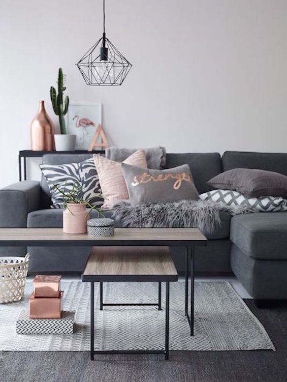
Styling and design for 2016 is the year of charcoal with neutral and blush tans.
Using basic tones and hints of blush creates a soft and calming impression. Use removable features such as pillows and vases that are easy to change when re-decorating.
The contrast of charcoal against blush or tan adds weight to soft pastels and makes a room stand out without being over-powering.
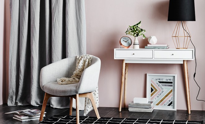
If you are working with a light blush wall such as our Soft Marshmallow pink, mix up the shapes and textures of your chosen décor in grey to create more of an edge, such as with a lounge chair, side table or an abstract lamp.
Make sure to avoid a fussy look by keeping the styling effortlessly simple and clean-lined by only choosing one or two, statement décor pieces to complete the look - adding or removing an item can make all the difference.
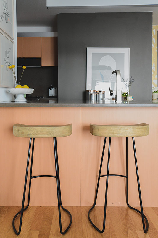
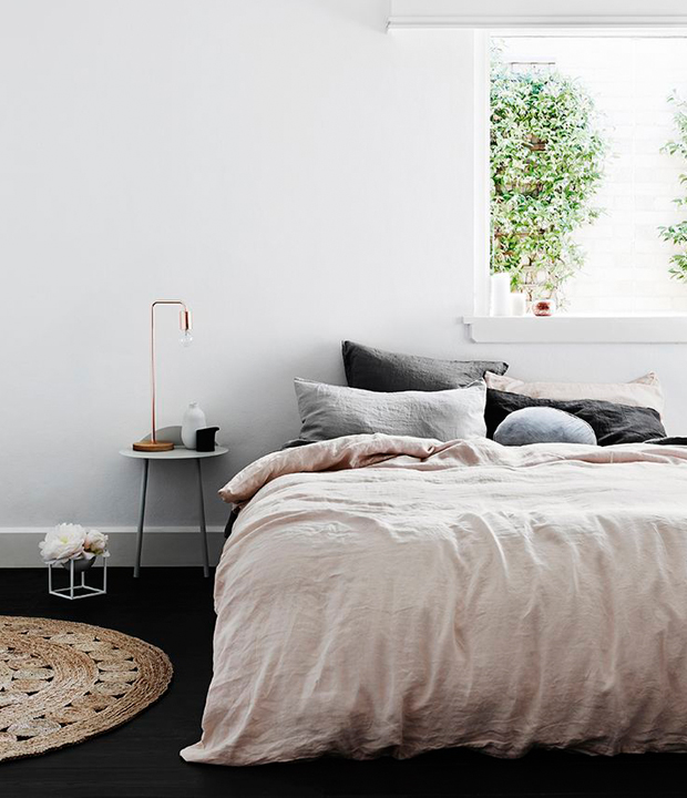
The great thing about these colour contrasts this season is that it works great for different spaces in your home from your bedroom, living room and kitchen – the juxtaposition is complementary however you choose to use it.
Share with us your favourite colour combination to style with on Instagram @British Paints, or by using #BritishPaints