Selected colour swatches
You can order up to 20 colour swatches
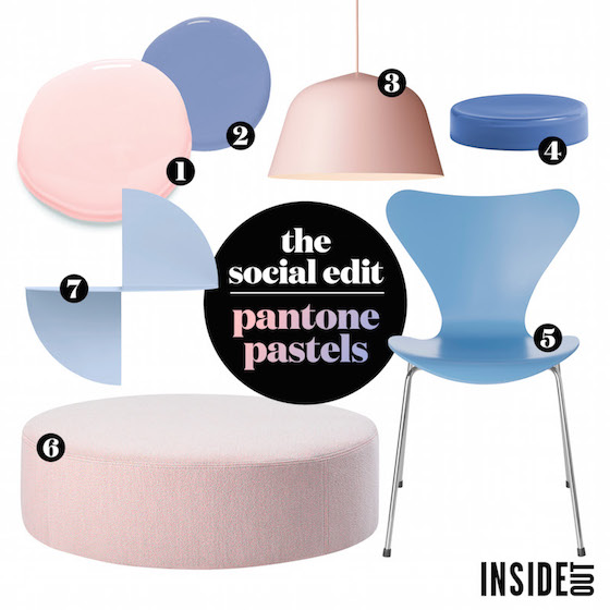
This Season’s Pastels
Inside Out Magazine has featured our Pink Dress and Ocean Plunge as colour to watch this month. They the perfect complimentary colours but also work just as well when they stand-alone in your home. Read on for some great examples of where these pastels work best, and how you can incorporate them in your home this season.
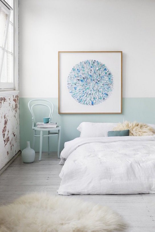
Pastel in the bedroom
Pastel colours look great in a white room, especially if you don’t want to go overboard with colour. Painting just half the wall also gives you freedom to change it up without taking up too much time.
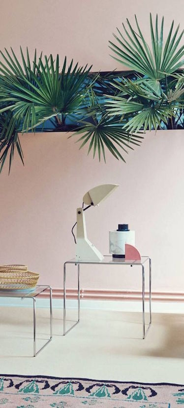
Pastel Pink
Using pastel pinks as your wall colour allows for plants and greenery to stand out and add that extra shape to a space. Choose sharp, or shapely plants that will compliment a room and create edge in a simplistic way.
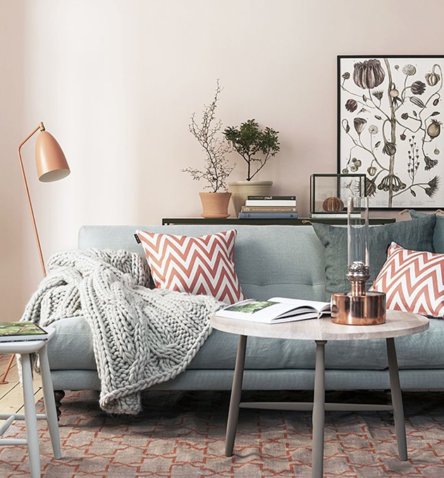
Combination pastels
If soft pink pastels are your preference, combine them with softer greys and blues within a lounge, cushions or a throw rug. The best part about soft pastel walls, is that as the seasons change, so can your décor colours without clashing.
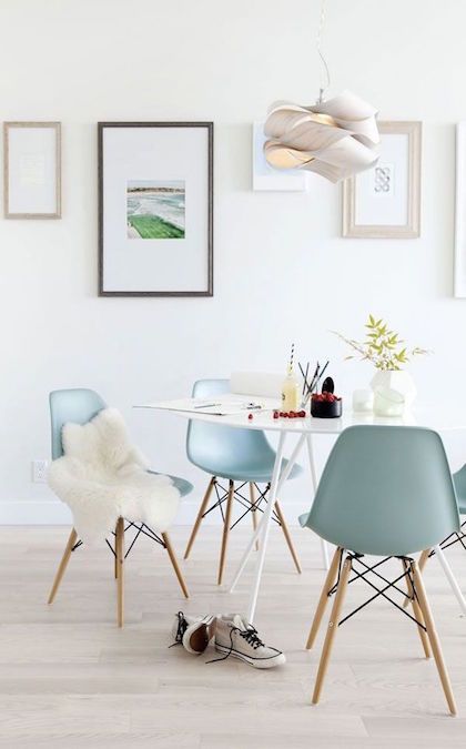
A pop of pastel
If you’re keen to test out the pastel trend but not committed to painting, play around with furniture. This is a great first step to help you feel comfortable before committing to paint – and as a bonus, pastel furniture works really well against white walls without over powering the room!
These pastel blue chairs are a great example as they don’t overpower the space but they inject a sense of character.
Share your favourite pastel spaces with us on Instagram @British Paints, using #BritishPaints