Selected colour swatches
You can order up to 20 colour swatches
Living

Planning the colour scheme for your living space takes some serious thought, as those choices will likely set the tone for the whole house.
Tempting though it may be to start poring over the paint charts, it’s important to start by looking at the more permanent elements in the room. If you’re not undergoing a complete reno, you’ll need to consider existing flooring and furniture. Factor in beloved artworks and rugs, and build your mood board around them. Here are three timeless living room schemes to create welcome vibes and a sense of harmony.
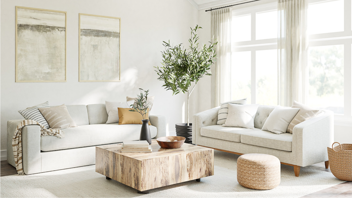
Classic neutrals
Yes, they’re safe, but also beautiful, easy pleasing and fun to accessorise. A blend of white, beige and stone hues will create a harmonious scheme with a timeless appeal. Consider the light in your living space: a modern open-plan home that’s drenched in daylight can take a cooler palette to soak up all that sun, whereas warmer tones will add warmth and welcome vibes to period homes that don't receive as much natural light. Greige will give you the best of both worlds as it goes with both warm and cool palettes depending on whether it leans more towards the grey or the beige. Team it with a corresponding warm or cool white trim for a look that says modern classic.
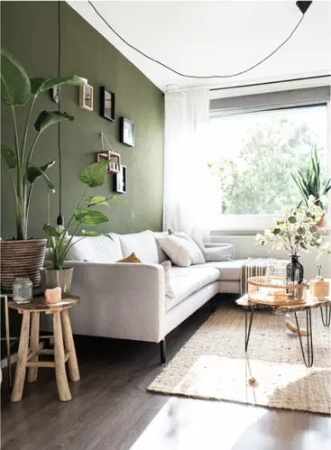
Natural greens
Green is the easiest colour for our eyes to process, and we can see more shades of green than any other hue. This may mean choosing a green colour scheme takes longer, but it’s time well spent! At the top of the green popularity charts are sage (Light Foliage, Green Deed) and muted mossy tones that create that relaxing environment you’ll look forward to coming home to. Team them with soft beige and a shot of brighter white for a fresh edge. Earthy toned olive (Hidden Grove) is a stronger colour with a mid-century vibe and is impactful on a feature wall. Soft succulent greens will enliven a tired living space, and gentle mint shades like Spaced Out will bring a playful, modern feel. Greens have the added advantage of being an honorary neutral, because they go so well with a range of accent colours from pink to yellow to sky blue.


383 Light Foliage 385 Green Deed


390 Hidden Grove 358 Spaced Out
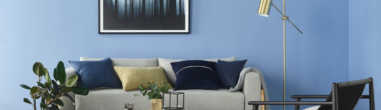
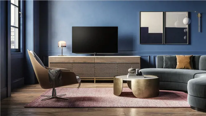
Inky blue
Ready to embrace the dark side? Dark charcoal blues such as Vintage Denim and Costa Rica Blue evoke a sense of calm and serenity, creating a striking and sophisticated look for feature walls in living spaces, and work particularly well with high, white ceilings and crisp white architraves.
They tie in nicely with the trend for naturally earthy colours, while offering boldness and a timeless sophistication. If you want to add complementary accents of colour, inky blue is the perfect backdrop for colourful artworks and accessories — choose blush pinks, sunny yellows and warm metallics such as copper and brass. It also shows off natural greenery to perfection. If you’re worried that a dark wall will make your space seem smaller, this isn’t necessarily the case. Dark colours can actually make a space seem larger, by defining boundaries and highlighting the height of walls.
Looking for colour schemes for other rooms?


297 Vintage Denim 298 Costa Rica Blue