Selected colour swatches
You can order up to 20 colour swatches
Understanding colour: a masterclass
Before you choose a colour for your living space or bedroom, it’s helpful to know why it affects us, and how. So let’s get back to colour basics.
Think about the colour yellow. Perhaps happiness and spontaneity come to mind. You might feel energised by the association of laughter and optimism. Or does it make you frustrated? (Did you know babies cry more in yellow rooms?) Sunflowers, buttercups and sand are all common mental images for the colour yellow. You may have your own unique set of feelings about it, but however you respond, respond you will. It’s a universal human experience, which is why understanding colour is such a powerful thing.
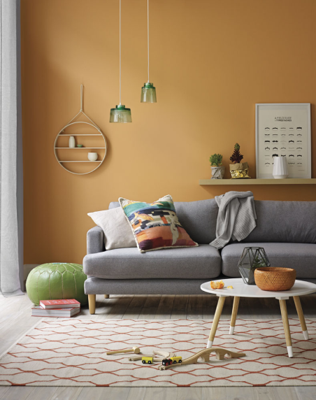
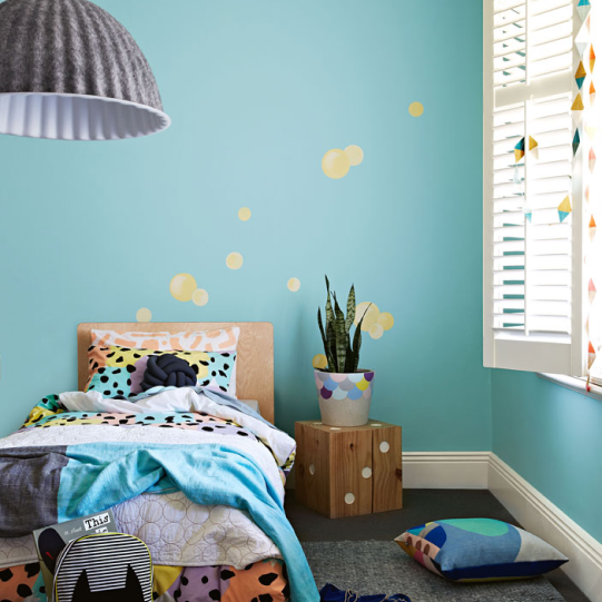
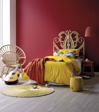
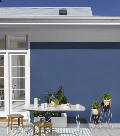
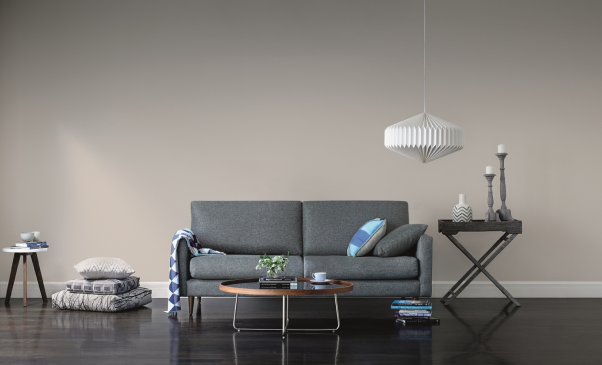
When it comes to putting paint on walls, colour affects not only the room, but also how a person feels when they’re in there. Isaac Newton first nailed the colour wheel back in the 17th century, showing how warm colours (reds, yellows, oranges) are vibrant, intimate and inviting, whereas cooler colours (blues, greens, purples) have a more relaxed vibe, and bring a sense of calm.
There are a few other terms you’ll come across in the great wide world of colour. Get to grips with these and you’ll soon be sounding like a pro.
Hue
You might think the word ‘hue’ is interchangeable with ‘colour’ but technically, it’s not. Hue refers to the pure, unmixed colours on the colour wheel, while colour takes in all the variables. So while red is a hue, coral is not. Got it? Good!
Primary, secondary, tertiary
Primary colours are the ‘true’ colours or hues, that you can’t get by mixing other colours. All other colours are made from these three: red, blue and yellow.
Secondary colours are what you get when you mix two primary colours together. Red + blue = violet; Blue + yellow = green; Yellow + red = orange.
Tertiary colours are made by mixing primary and secondary colours together. There are six: red-orange, yellow-orange, yellow-green, blue-green, blue-violet and red-violet.
Colour value
This refers to the lightness or darkness of a colour. Adding black will darken it, while adding white will lighten it. In interior speak, the colour value is divided further into:
Shade – a darker version of a colour that you get by adding black. For example, if you add black to green, you get bottle green. If you add black to blue, you create navy blue, and so on.
Tint – a lighter version of a colour that you get by adding white. For example, if you add white to red, it becomes pink. Adding white to most colours achieves a pastel version of that colour.
Tone – tones are created when you add both white and black to a colour. You might also hear this referred to as ‘greying down’. Unless you’re going for bold primary or secondary colours, your colour choice will likely be some kind of tone.
Now you have a good understanding of colour, you might be interested in how to use colour and how to create a colour scheme.